Plotting and Visualization
Making informative visualizations (sometimes called plots) is one of the most important tasks in data analysis. It may be a part of the exploratory process—for example, to help identify outliers or needed data transformations, or as a way of generating ideas for models. matplotlib is a desktop plotting package designed for creating (mostly two-dimensional) publication-quality plots. matplotlib supports various GUI backends on all operating systems and additionally can export visualizations to all of the common vector and raster graphics formats (PDF, SVG, JPG, PNG, BMP, GIF, etc.).
A Brief matplotlib API Primer
With matplotlib, we use the following import convention :
In [11]: import matplotlib.pyplot as plt
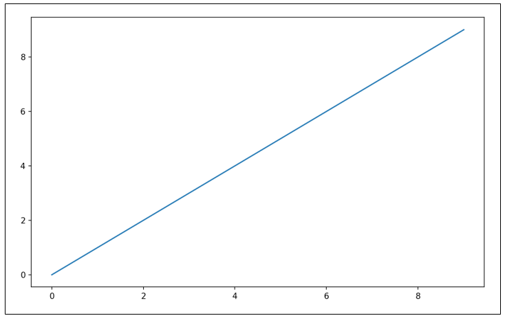
After running %matplotlib notebook in Jupyter (or simply %matplotlib in IPython), we can try creating a simple plot. If everything is set up right, a line plot appear :
In [12]: import numpy as np
In [13]: data = np.arange(10)
In [15]: plt.plot(data)
Figures and Subplots
Plots in matplotlib reside within a Figure object. You can create a new figure with plt.figure :
In [16]: fig = plt.figure()
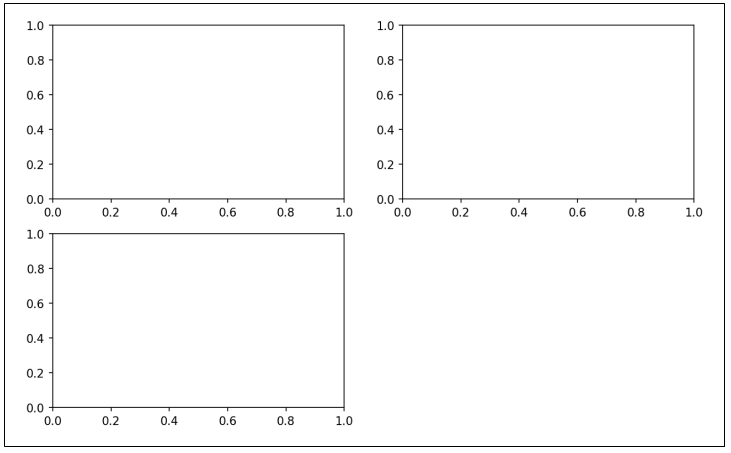
In IPython, an empty plot window will appear, but in Jupyter nothing will be shown until we use a few more commands. plt.figure has a number of options; notably, figsize will guarantee the figure has a certain size and aspect ratio if saved to disk. You can’t make a plot with a blank figure. You have to create one or more subplots using add_subplot :
In [17]: ax1 = fig.add_subplot(2, 2, 1)
In [18]: ax2 = fig.add_subplot(2, 2, 2)
In [19]: ax3 = fig.add_subplot(2, 2, 3)
When you issue a plotting command like plt.plot([1.5, 3.5, -2, 1.6]), matplotlib draws on the last figure and subplot used (creating one if necessary), thus hiding the figure and subplot creation.
In [20]: plt.plot(np.random.randn(50).cumsum(), 'k--')
The ‘k–’ is a style option instructing matplotlib to plot a black dashed line. Creating a figure with a grid of subplots is a very common task, so matplotlib includes a convenience method, plt.subplots, that creates a new figure and returns a NumPy array containing the created subplot objects. This is very useful, as the axes array can be easily indexed like a two-dimensional array; for example, axes[0, 1]. You can also indicate that subplots should have the same x- or y-axis using sharex and sharey, respectively.
In [24]: fig, axes = plt.subplots(2, 3)
pyplot.subplots optons :
| Argument | Description |
|---|---|
| nrows | Number of rows of subplots |
| ncols | Number of columns of subplots |
| sharex | All subplots should use the same x-axis ticks (adjusting the xlim will affect all subplots) |
| sharey | All subplots should use the same y-axis ticks (adjusting the ylim will affect all subplots) |
| subplot_kw | Dict of keywords passed to add_subplot call used to create each subplot |
| **fig_kw | Additional keywords to subplots are used when creating the figure, such as plt.subplots(2, 2, figsize=(8, 6)) |
By default matplotlib leaves a certain amount of padding around the outside of the subplots and spacing between subplots. This spacing is all specified relative to the height and width of the plot, so that if you resize the plot either programmatically or manually using the GUI window, the plot will dynamically adjust itself. You can change the spacing using the subplots_adjust method on Figure objects, also available as a top-level function :
subplots_adjust(left=None, bottom=None, right=None, top=None,wspace=None, hspace=None)
Colors, Markers, and Line Styles
Matplotlib’s main plot function accepts arrays of x and y coordinates and optionally a string abbreviation indicating color and line style. For example, to plot x versus y with green dashes, you would execute :
ax.plot(x, y, 'g--')
This way of specifying both color and line style in a string is provided as a convenience; in practice if you were creating plots programmatically you might prefer not to have to munge strings together to create plots with the desired style. The same plot could also have been expressed more explicitly as :
ax.plot(x, y, linestyle='--', color='g')
Line plots can additionally have markers to highlight the actual data points. Since matplotlib creates a continuous line plot, interpolating between points, it can occasionally be unclear where the points lie. The marker can be part of the style string, which must have color followed by marker type and line style :
In [30]: from numpy.random import randn
In [31]: plt.plot(randn(30).cumsum(), 'ko--')
This could also have been written more explicitly as :
plot(randn(30).cumsum(), color='k', linestyle='dashed', marker='o')
Ticks, Labels, and Legends
The pyplot interface, designed for interactive use, consists of methods like xlim, xticks, and xticklabels. These control the plot range, tick locations, and tick labels, respectively. They can be used in two ways :
- Called with no arguments returns the current parameter value (e.g., plt.xlim() returns the current x-axis plotting range)
- Called with parameters sets the parameter value (e.g., plt.xlim([0, 10]), sets the x-axis range to 0 to 10)
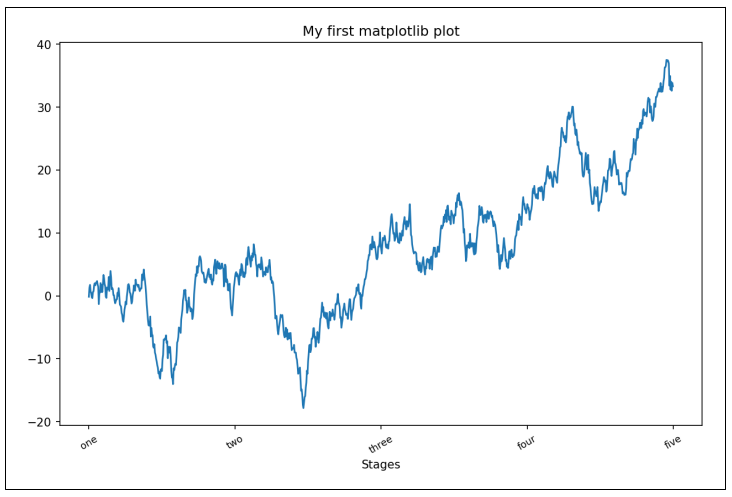
To illustrate customizing the axes, We’ll create a simple figure and plot of a random walk :
In [37]: fig = plt.figure()
In [38]: ax = fig.add_subplot(1, 1, 1)
In [39]: ax.plot(np.random.randn(1000).cumsum())
To change the x-axis ticks, it’s easiest to use set_xticks and set_xticklabels. The former instructs matplotlib where to place the ticks along the data range; by default these locations will also be the labels. But we can set any other values as the labels using set_xticklabels. Lastly, set_xlabel gives a name to the x-axis and set_title the subplot title :
In [40]: ticks = ax.set_xticks([0, 250, 500, 750, 1000])
In [41]: labels = ax.set_xticklabels(['one', 'two', 'three', 'four', 'five'],
   ....:                             rotation=30, fontsize='small')
In [42]: ax.set_title('My first matplotlib plot')
In [43]: ax.set_xlabel('Stages')
Modifying the y-axis consists of the same process, substituting y for x in the above. Legends are another critical element for identifying plot elements. There are a couple of ways to add one. The easiest is to pass the label argument when adding each piece of the plot. Once you’ve done this, you can either call ax.legend() or plt.legend() to automatically create a legend :
In [44]: from numpy.random import randn
In [45]: fig = plt.figure(); ax = fig.add_subplot(1, 1, 1)
In [46]: ax.plot(randn(1000).cumsum(), 'k', label='one')
In [49]: ax.legend(loc='best')
The loc tells matplotlib where to place the plot. If you aren’t picky, ‘best’ is a good option, as it will choose a location that is most out of the way. To exclude one or more elements from the legend, pass no label or label=’nolegend’.
Annotations and Drawing on a Subplot
In addition to the standard plot types, you may wish to draw your own plot annotations, which could consist of text, arrows, or other shapes. You can add annotations and text using the text, arrow, and annotate functions. text draws text at given coordinates (x, y) on the plot with optional custom styling :
ax.text(x, y, 'Hello world!', family='monospace', fontsize=10)
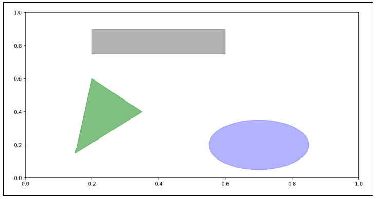
Drawing shapes requires some more care. matplotlib has objects that represent many common shapes, referred to as patches. Some of these, like Rectangle and Circle, are found in matplotlib.pyplot, but the full set is located in matplotlib.patches. To add a shape to a plot, you create the patch object shp and add it to a subplot by calling ax.add_patch(shp) :
fig = plt.figure()
ax = fig.add_subplot(1, 1, 1)
rect = plt.Rectangle((0.2, 0.75), 0.4, 0.15, color='k', alpha=0.3)
circ = plt.Circle((0.7, 0.2), 0.15, color='b', alpha=0.3)
pgon = plt.Polygon([[0.15, 0.15], [0.35, 0.4], [0.2, 0.6]], color='g', alpha=0.5)
ax.add_patch(rect)
ax.add_patch(circ)
ax.add_patch(pgon)
Saving Plots to File
You can save the active figure to file using plt.savefig. This method is equivalent to the figure object’s savefig instance method. For example, to save an SVG version of a figure, you need only type :
plt.savefig('figpath.svg')
To get the same plot as a PNG with minimal whitespace around the plot and at 400 DPI, you would do :
plt.savefig('figpath.png', dpi=400, bbox_inches='tight')
Plotting with pandas and seaborn
In pandas we may have multiple columns of data, along with row and column labels. pandas itself has built-in methods that simplify creating visualizations from DataFrame and Series objects. Another library is seaborn, a statistical graphics library created by Michael Waskom. Seaborn simplifies creating many common visualization types.
Line Plots
Series and DataFrame each have a plot attribute for making some basic plot types. By default, plot() makes line plots.
In [60]: s = pd.Series(np.random.randn(10).cumsum(), index=np.arange(0, 100, 10))
In [61]: s.plot()
DataFrame’s plot method plots each of its columns as a different line on the same subplot, creating a legend automatically :
In [62]: df = pd.DataFrame(np.random.randn(10, 4).cumsum(0),
   ....:                   columns=['A', 'B', 'C', 'D'],
   ....:                   index=np.arange(0, 100, 10))
In [63]: df.plot()
Bar Plots
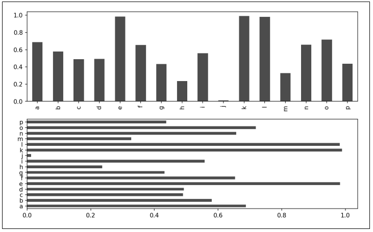
The plot.bar() and plot.barh() make vertical and horizontal bar plots, respectively. In this case, the Series or DataFrame index will be used as the x (bar) or y (barh) ticks :
In [64]: fig, axes = plt.subplots(2, 1)
In [65]: data = pd.Series(np.random.rand(16), index=list('abcdefghijklmnop'))
In [66]: data.plot.bar(ax=axes[0], color='k', alpha=0.7)
In [67]: data.plot.barh(ax=axes[1], color='k', alpha=0.7)
We create stacked bar plots from a DataFrame by passing stacked=True, resulting in the value in each row being stacked together.
Histograms and Density Plots
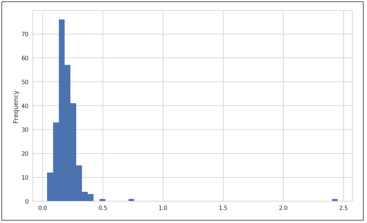
A histogram is a kind of bar plot that gives a discretized display of value frequency. The data points are split into discrete, evenly spaced bins, and the number of data points in each bin is plotted. Using the tipping data from before, we can make a histogram of tip percentages of the total bill using the plot.hist method on the Series.
In [92]: tips['tip_pct'].plot.hist(bins=50)
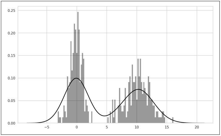
A related plot type is a density plot, which is formed by computing an estimate of a continuous probability distribution that might have generated the observed data. The usual procedure is to approximate this distribution as a mixture of “kernels”—that is, simpler distributions like the normal distribution. Thus, density plots are also known as kernel density estimate (KDE) plots. Using plot.kde makes a density plot using the conventional mixture-of-normals estimate. Seaborn makes histograms and density plots even easier through its distplot method, which can plot both a histogram and a continuous density estimate simultaneously. As an example, consider a bimodal distribution consisting of draws from two different standard normal distributions.
In [96]: comp1 = np.random.normal(0, 1, size=200)
In [97]: comp2 = np.random.normal(10, 2, size=200)
In [98]: values = pd.Series(np.concatenate([comp1, comp2]))
In [99]: sns.distplot(values, bins=100, color='k')
Scatter or Point Plots
Point plots or scatter plots can be a useful way of examining the relationship between two one-dimensional data series. For example, here we load the macrodata dataset from the statsmodels project, select a few variables, then compute log differences :
In [100]: macro = pd.read_csv('examples/macrodata.csv')
In [101]: data = macro[['cpi', 'm1', 'tbilrate', 'unemp']]
In [102]: trans_data = np.log(data).diff().dropna()
In [103]: trans_data[-5:]
cpi m1 tbilrate unemp
198 -0.007904 0.045361 -0.396881 0.105361
199 -0.021979 0.066753 -2.277267 0.139762
200 0.002340 0.010286 0.606136 0.160343
201 0.008419 0.037461 -0.200671 0.127339
202 0.008894 0.012202 -0.405465 0.042560
We can then use seaborn’s regplot method, which makes a scatter plot and fits a linear regression line :
In [105]: sns.regplot('m1', 'unemp', data=trans_data)
In exploratory data analysis it’s helpful to be able to look at all the scatter plots among a group of variables; this is known as a pairs plot or scatter plot matrix. Making such a plot from scratch is a bit of work, so seaborn has a convenient pairplot function, which supports placing histograms or density estimates of each variable along the diagonal :
In [107]: sns.pairplot(trans_data, diag_kind='kde', plot_kws={'alpha': 0.2})
Facet Grids and Categorical Data
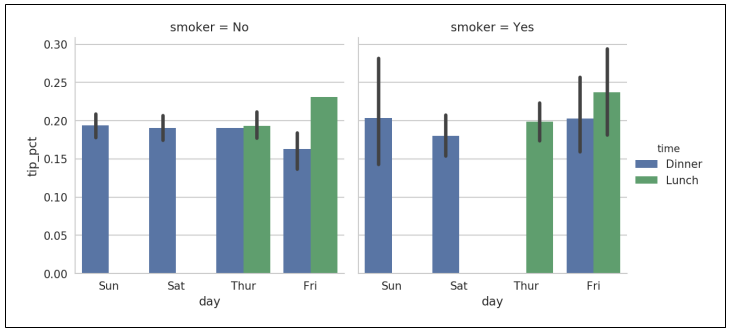
What about datasets where we have additional grouping dimensions? One way to visualize data with many categorical variables is to use a facet grid. Seaborn has a useful built-in function factorplot that simplifies making many kinds of faceted plots.
In [108]: sns.factorplot(x='day', y='tip_pct', hue='time', col='smoker',
   .....:                kind='bar', data=tips[tips.tip_pct < 1])
factorplot supports other plot types that may be useful depending on what you are trying to display. For example, box plots (which show the median, quartiles, and outliers) can be an effective visualization type :
In [110]: sns.factorplot(x='tip_pct', y='day', kind='box',
   .....:                data=tips[tips.tip_pct < 0.5])
